There’s nothing like designing the perfect nursery but this area is so much more than just décor. This is the space you’ll be welcoming your baby home to and let’s face it, a place you’ll both be spending a significant amount of time in.
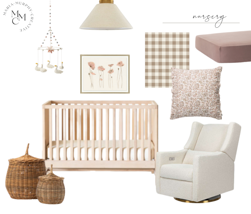
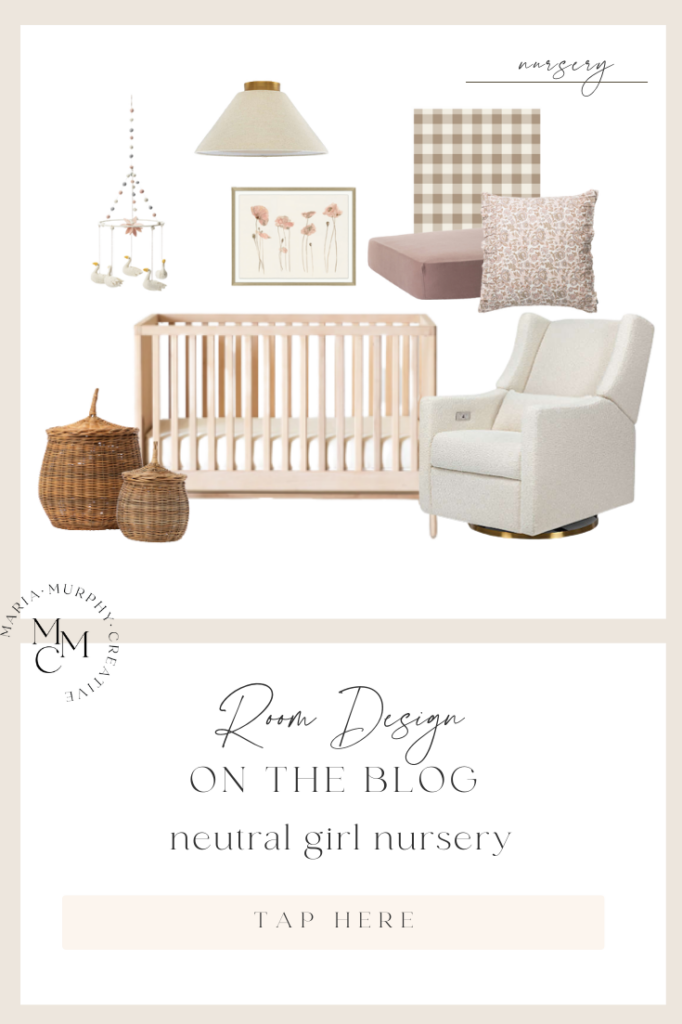
With so many designs and palette options to choose from, your Pinterest board is likely exploding with ideas! Today, I’m taking all the guesswork out and creating the perfect Neutral Baby Girl Nursery! A space that’s both swoon-worthy and that will fit into any home.
Shop this Room
There’s something so sweet about designing a feminine nursery. I imagine pink was the first color to come to mind when hearing “it’s a girl” for the first time. Using pink for inspiration, I put together a soft and delicate palette of light pinks and neutral tones that are airy and light, but still adorable, girly, and perfect for our Neutral Baby Girl Nursery.
With our color palette in place, we can begin to build out the rest of our design. Now, before you start adding all things “nursery” to your shopping cart, it’s important to think about both the size and layout of your space.
When considering the overall room layout, the first question you’ll want to ask yourself is “How big is the room?”. The size of your space is an important factor when making furniture selections and measuring your walls will help you choose the appropriate size. To keep things simple, draw the layout of your nursery to visualize exactly where your biggest pieces will go. We want to create a cozy and safe environment for both mom and baby, so less is more, especially in smaller spaces.
Crib 1 | Crib 2 | Crib 3 | Crib 4
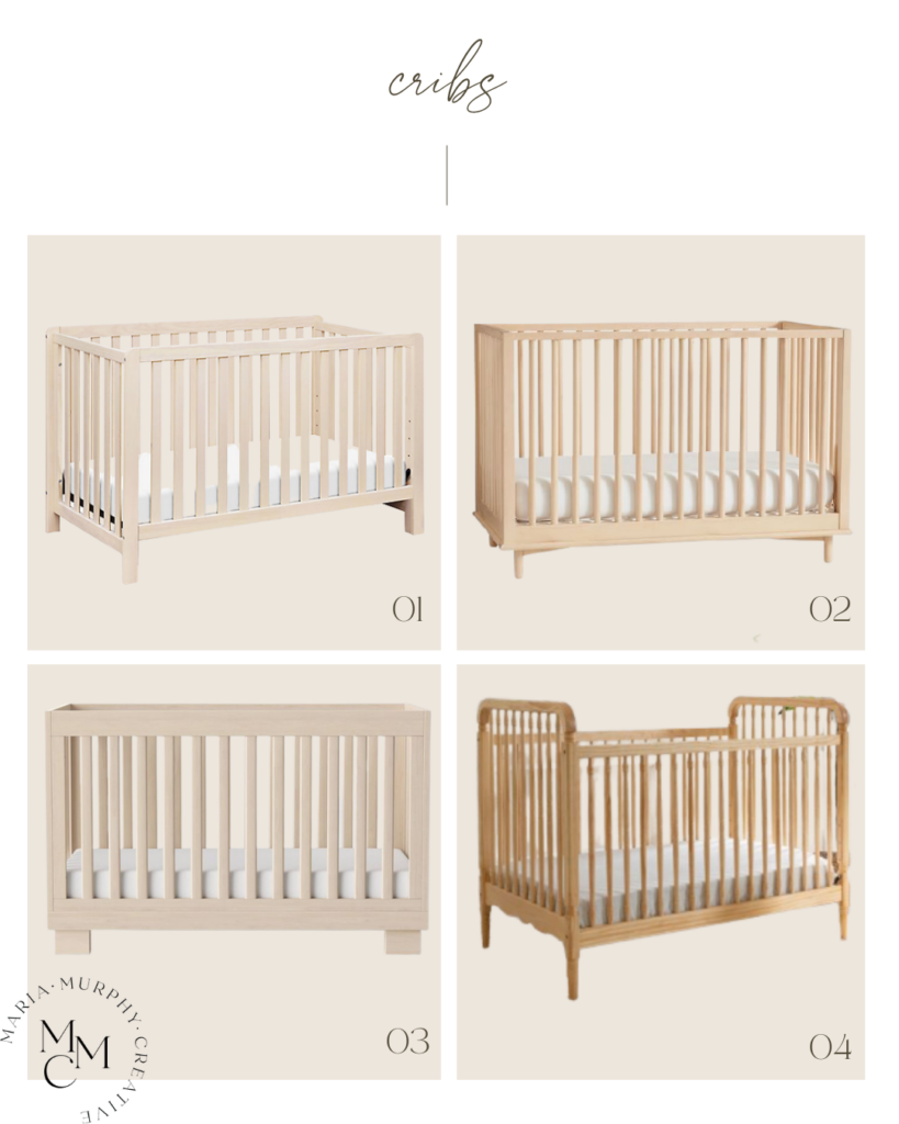
The crib is the anchor piece of every nursery. While it should incorporate style, function and safety, we’re secretly hoping it also creates a sense of tranquility and encourages that elusive thing called “sleep”!
I’ve selected a few pieces with a simple yet modern design, that adds a unique touch, while also pulling together the overall look of the nursery. A neutral crib design, like THIS Liberty 3-in-1 from Wayfair, grows with baby. With its easy conversion kit, you can adapt from crib to toddler bed, to daybed! The neutral color will also allow for easy design or style-change ups, as your little one grows.
When deciding on crib placement, aim for the center wall, preferably the largest or “feature” wall, as this will be your focal point and the first thing that catches your eye when walking in. Aside from design and style, you’ll also want to consider safety features and height adjustments and ensure slats are no more than 6cm apart.
Chair 1 | Chair 2 | Chair 3 | Chair 4
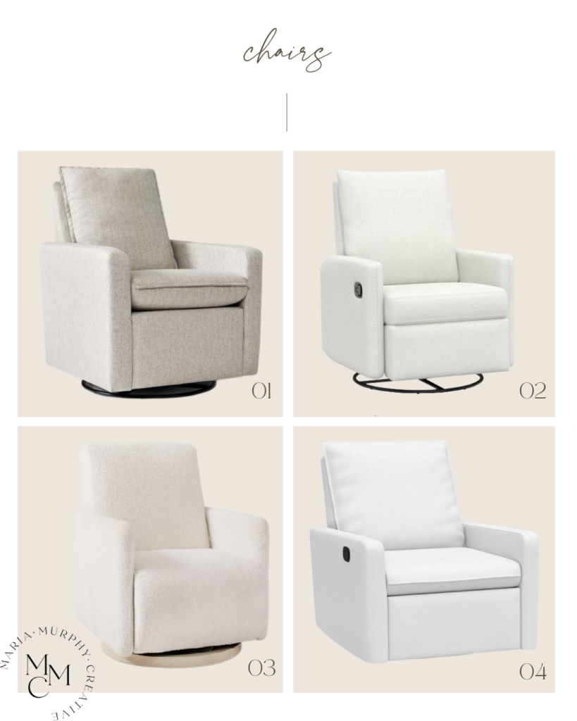
While the crib might be the “Star”, of the nursery, the real “MVP” is going to be your glider, and trust me it’s about to become your new BFF!
With late-night nursing sessions, baby snuggles, lullabies, and story time, comfort is an absolute must! The good news is you don’t have to sacrifice comfort for style.
I love THIS chair from West Elm Kids since it offers the ability to both glide and swivel. You’ll have the perfect glide/swivel action down in no time, sure to soothe any cry. The sleek design and soft cream color pair well with the room’s neutral modern design. The chunky fabric also adds great texture, making this an overall great addition to any nursery. Did I mention they also offer a matching ottoman!
When determining the best location for your glider, think of a corner facing outwards and ideally next to a window. I can’t think of anything more soothing than the thought of rocking your baby to sleep, while window gazing, as the day’s stress seems to instantly melt away.
Art 1 | Art 2 | Art 3 | Art 4 | Art 5 | Art 6
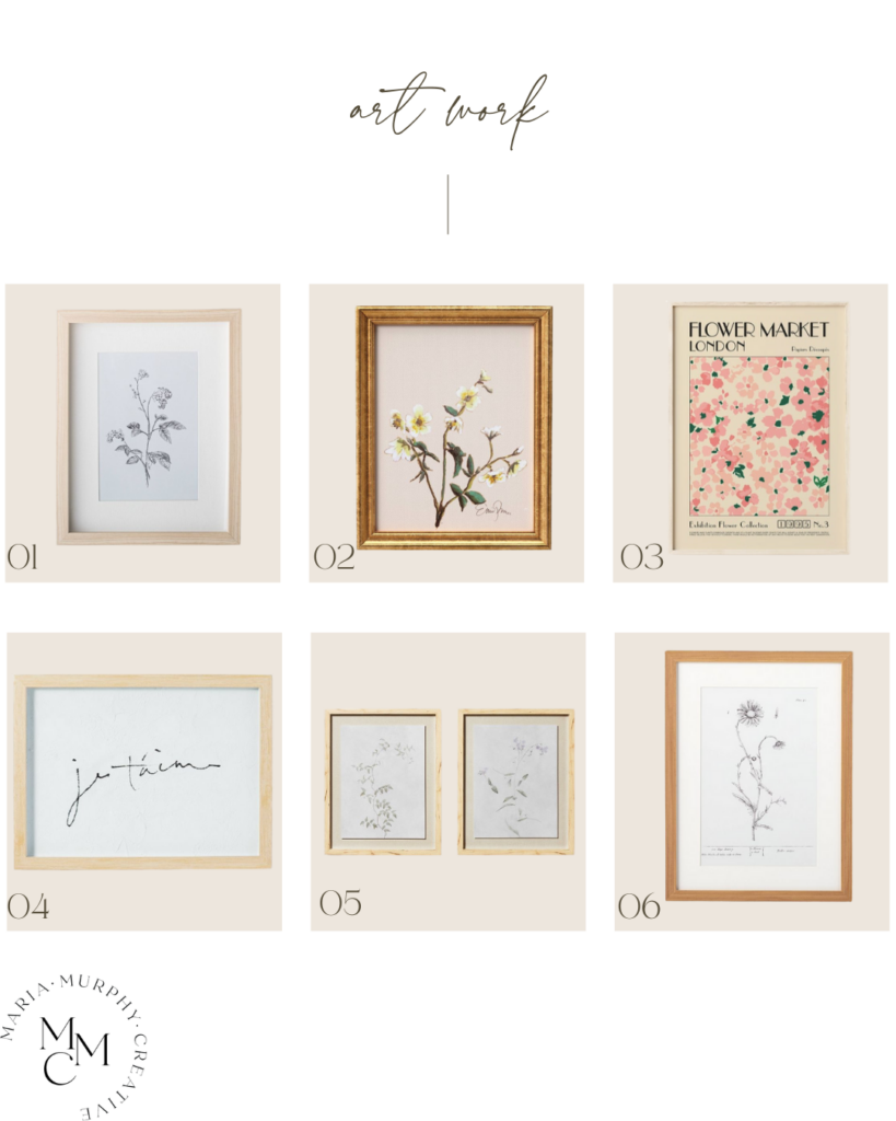
Artwork is a wonderful addition to any nursery, adding character and personality, while also tying together your overall design. Whether you’re making a statement or bringing in that pop of color, wall art is a great way to achieve a simple chic look.
How beautiful are the floral accents in THIS piece from McGhee & CO! The light pink and soft neutral pastels offer a subtle whimsical charm, adding the perfect touch of elegance to our nursery design. I’ve selected a few other options I think you’ll enjoy!
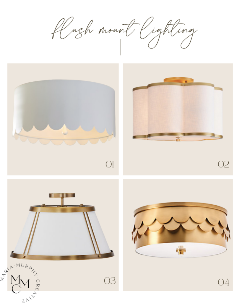
Light 1 | Light 2 | Light 3 | Light 4
Every detail of your nursery is important, even something as seemingly simple as lighting. Selecting the right lighting will not only create a peaceful ambiance but will also complement your space.
I’ve narrowed down a few of my favorite lighting options above. THIS flush mount from Pottery Barn Kids is absolutely adorable! With its unique metal scalloped edges, it adds unique detailing, complimenting our space.
I hope you’ve fallen in love with this charming Neutral Baby Girl nursery and are ready to incorporate these design ideas into your own space, as you create the perfect nursery for your baby girl!
Shop this Post
Struggling to design a space in your home? Check out my custom shop links HERE, with an optional 1:1 consultation bonus offer, for an even more customized final design! For more design inspiration follow me on Instagram and Pinterest!
Pin this post for later


Comments +